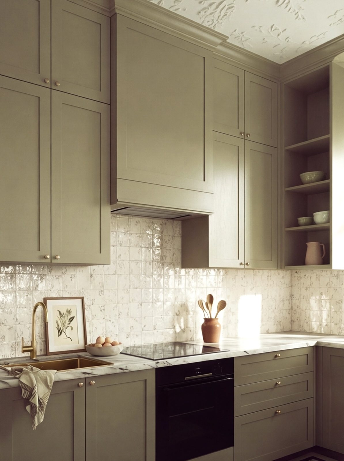
Green kitchen ideas: why colour is having a moment
30 July 2026 · Design
Green has moved from an occasional request to one of the most common colours clients bring to a first design meeting. Part of the appeal is how much range sits under one word: deep bottle and forest greens read as formal and tailored, while sage, olive, and muted eucalyptus tones feel softer and more forgiving in a smaller kitchen.
Choosing the right shade of green
Darker greens work best where a kitchen gets reasonable natural light or where you want a deliberately atmospheric, slightly formal feel, they can read as flat and heavy in a genuinely dark room. Softer sage and grey-greens are more adaptable to lower light and pair more easily with warm timber worktops and brass hardware, which is why they have become the more common request for open-plan kitchen-diners.
Finish matters as much as the colour itself
The same green looks noticeably different in a matt spray finish versus a satin or gloss sheen. Matt finishes read as more contemporary and hide fingerprints better on handleless doors, while a slight sheen can lift a darker green so it doesn't feel too heavy in a room with limited light. We always show colour and finish together on a physical sample, in your own kitchen's natural light, before anything is signed off, since screens and swatch books rarely represent either accurately.
What to pair green with
Green cabinetry generally sits well against warm materials, oak or walnut open shelving, brass or unlacquered brass hardware, and a stone worktop with some warmth in its veining rather than a stark white. Cooler pairings, like polished chrome and pure white stone, can work too, but tend to push a green kitchen toward a cooler, more clinical feel, worth deciding deliberately rather than by accident.
Will it still look right in ten years
Green has enough history as a kitchen colour, it was common well before this current wave, that it is a safer long-term choice than many trend colours. Muted, slightly greyed-down greens age particularly well, since they read more as a neutral with character than as a strong statement colour that can feel dated once the trend moves on.
Planning a project?
Book a design visit to talk through layout, materials, and timeline with our team.
Related reading
- Handleless kitchens: pros, cons, and what they costHandleless kitchens look clean and minimal, but they are not the right choice for every household. Here is what actually changes with a handleless design, and what it adds to the price.
- Wardrobe for loft conversions: fitted storage for sloped ceilingsNeed a wardrobe for a loft bedroom? A sloped ceiling is not a reason to give up on proper storage. Here is how a fitted design works with the angles instead of ignoring them.
- Integrated appliances and the pursuit of clean linesColumn fridges, dishwashers behind matching doors, and compact ovens all demand precise gaps. Why millimetres matter for flush fitting.